|
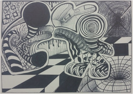
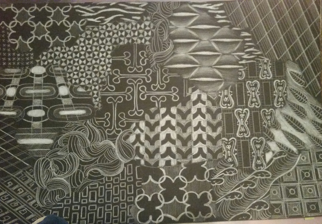
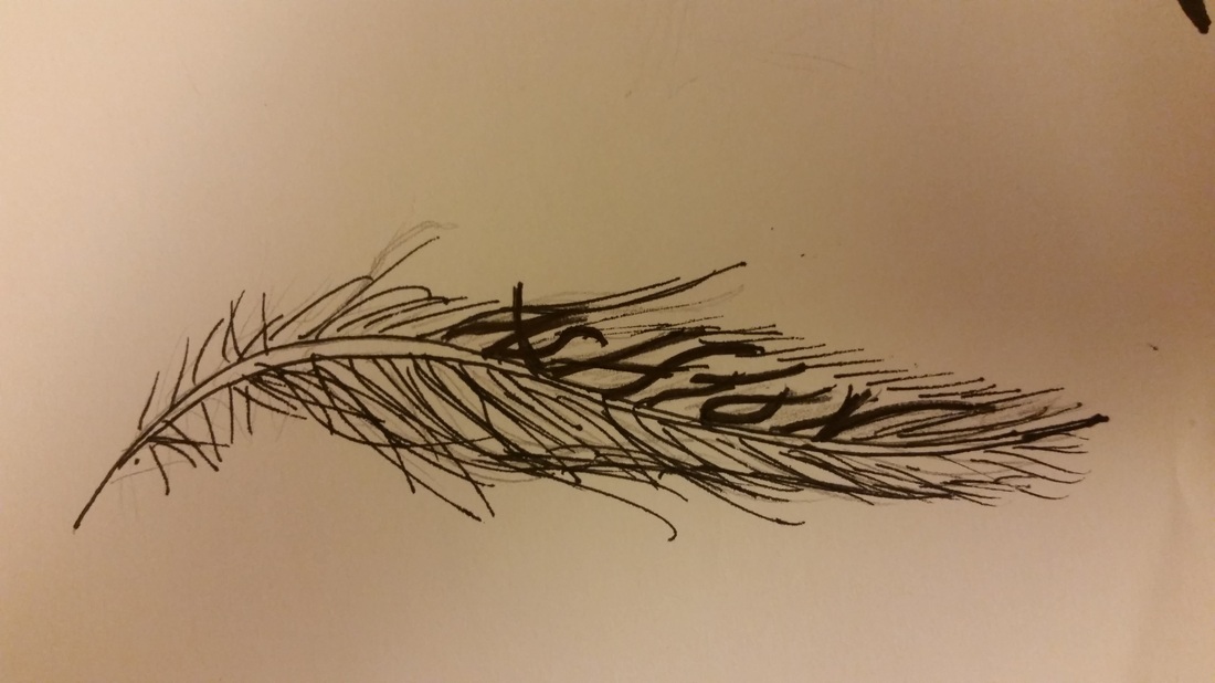
For something so simple, this project sure brought about a lot of challenges. Sometimes the easiest things are also the hardest. The biggest challenge was coming up with the idea of what I wanted to draw. How do you draw something while "nothing", at the same time? I think the problem is hinged upon everyone's idea of what a line is; just a simple vertical and horizontal mark, right? It was coming up with different variations on this simple concept, (like line thickness, contrast, parallel lines, overlapping lapping lines etc) that forced me to think in a new way.
My first draft was similar to my final project, but different in key areas. Chief among them is the differences in the depth and dimension. My first draft had small details, but not enough large lines to help make it pop. I also added several black hole areas to pull the eye inward. |
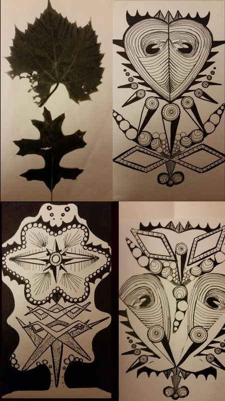
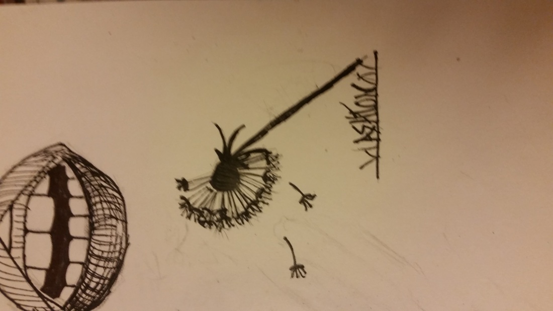
Oh how ideas can transform! I started this project inspired by a single picture I found in a magazine. The picture looked like a bunch of aluminium foil bunched together. The result was a lot of discontinuous sharp edges. I decided that what I wanted was something similar to this picture. Geometric shapes with a lot of movement; the flow of energy from one area to the next. With this in mind I knew my background 'shards' would be moving in the opposite position than those that were on the foreground. These were my base point ideas. Eventually I decided that a tree shape would be fun to work with, but it hard a lot of upward directional force. This composition didn't look right, where could I put the organic elements? I decided that placing an upside down flower pot which would explode onto the top of the tree would be neat. But the more I worked with it, the more the tree trunk looked like a strained human neck. I decided that I like this composition the best, so it is what I stuck with.
|
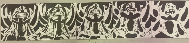
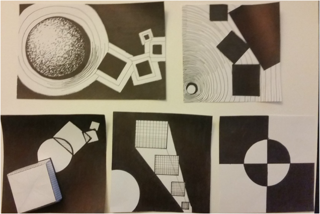
This project had one purpose, to express dominance, stability, individuality, and opposition.
Technically, I messed up this project big time the first time I did it. We were only allowed to draw one circle and four squares. Because I wanted to take it to the next level, I used techniquies |
|
For this project we got to experiment with various patterns. My main goal was to have a lot of directional force. I wanted the dominant patterns to be leading off in different directions. Some elements were meant to have movement, others flow or rhythm. I think I achieved this to a degree. What I could have worked on was the contrast. I had a lot of medium shades, but few extremes. (The low lights, and "hot spots".) All the tones seem to reside at a 3 range. Over all I was quite pleased with the piece, and satisfied with how it turned out. The most nerve racking thing about this project was not being able to use an eraser for any mistakes. And I make a lot of mistakes... None that were too prevalent in this project, thank god.
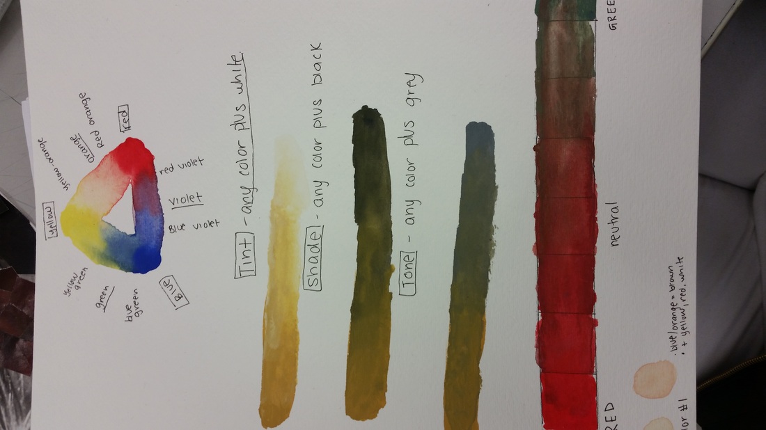
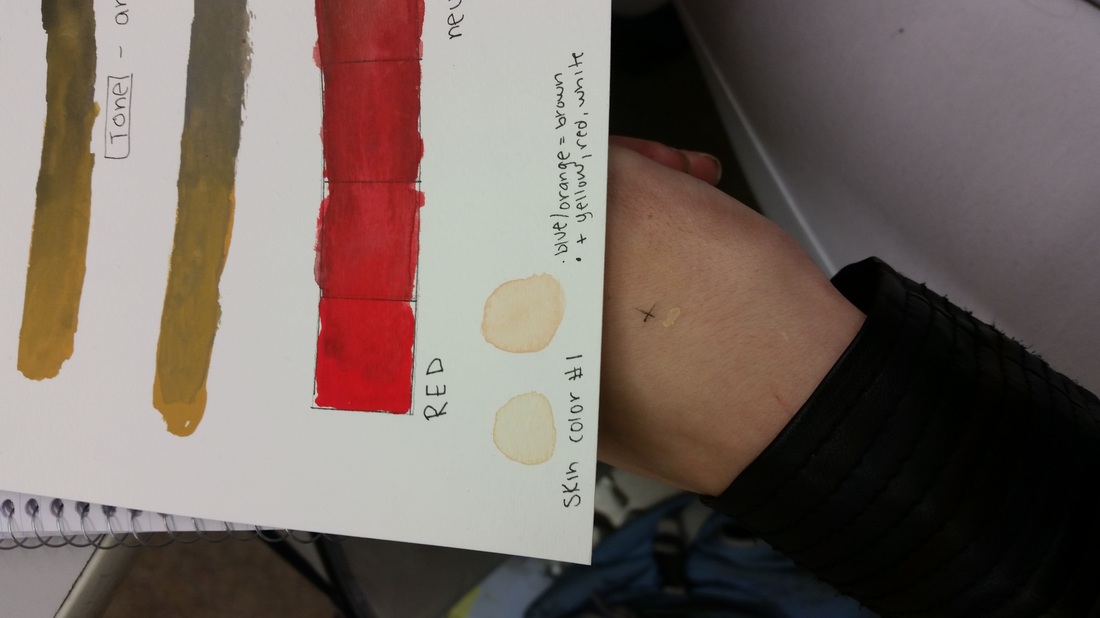
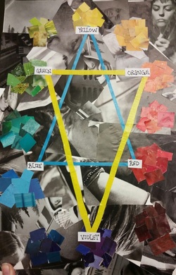
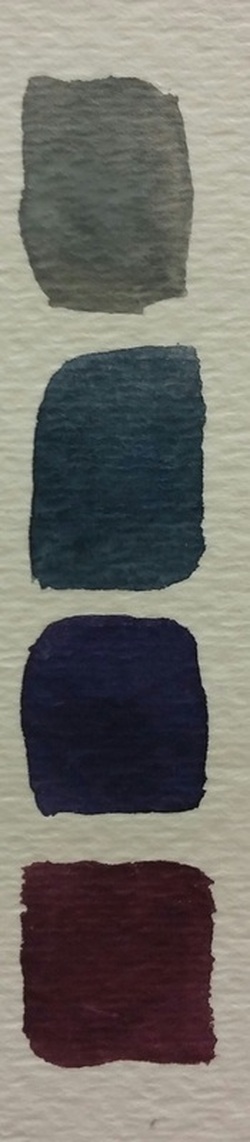
Color! I've been waiting for this unit all semester! Color has such important impact in artistic pieces, and I know virtually nothing about it. Our class got to learn about all the different colors, and how to make them. Primary colors, then secondary colors, as well as complimentary colors. This lesson was a tremendous help, and probably one of the most useful units we've learned all semester. We got to create a color wheel, as well as mix colors together. Images are above!
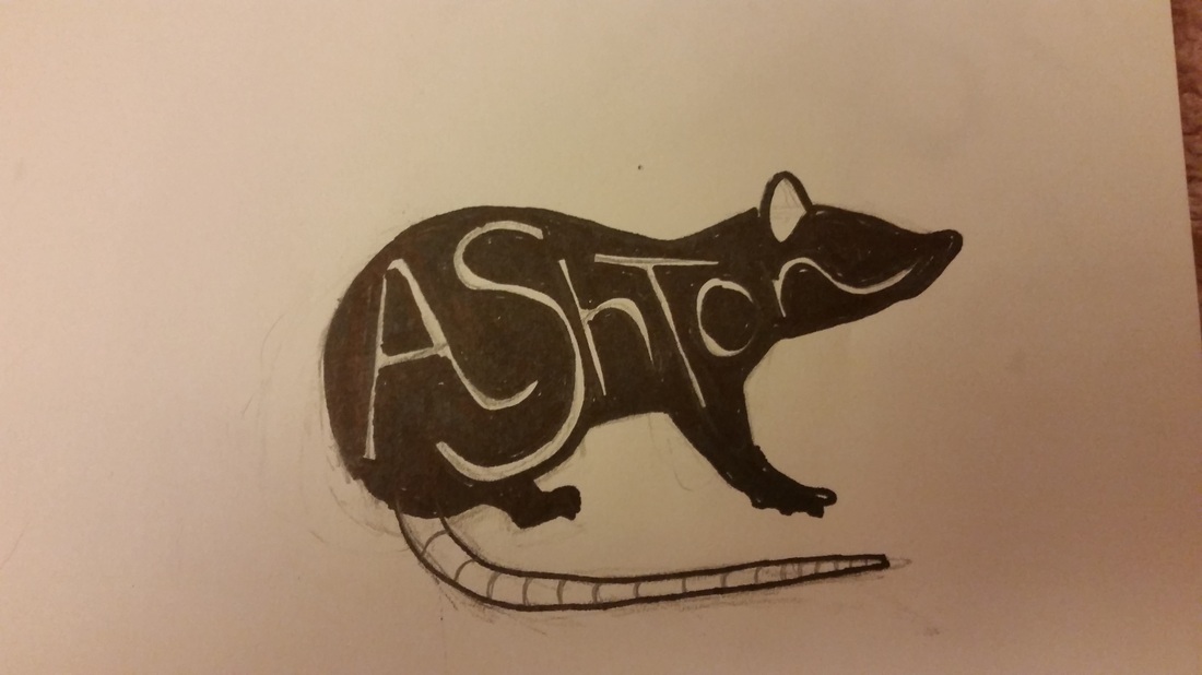
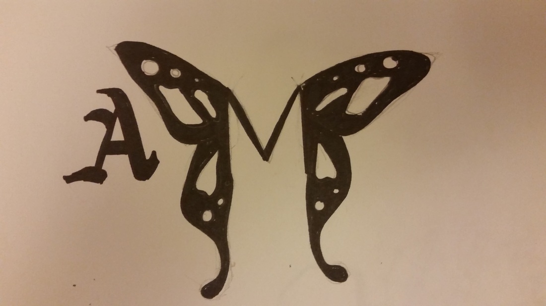
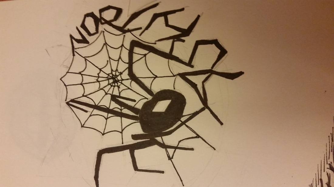
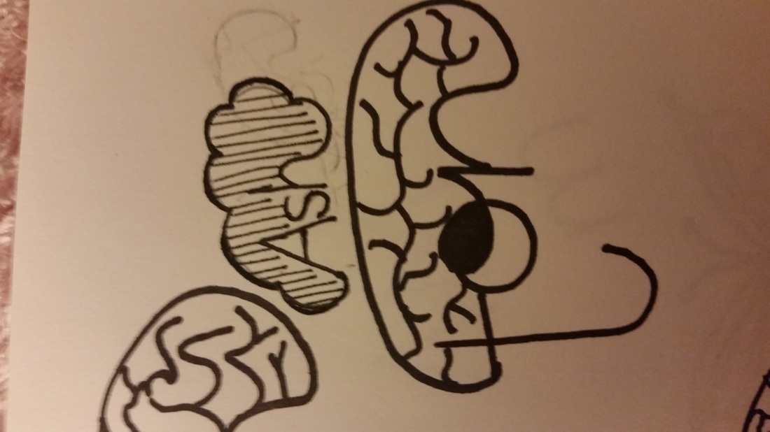
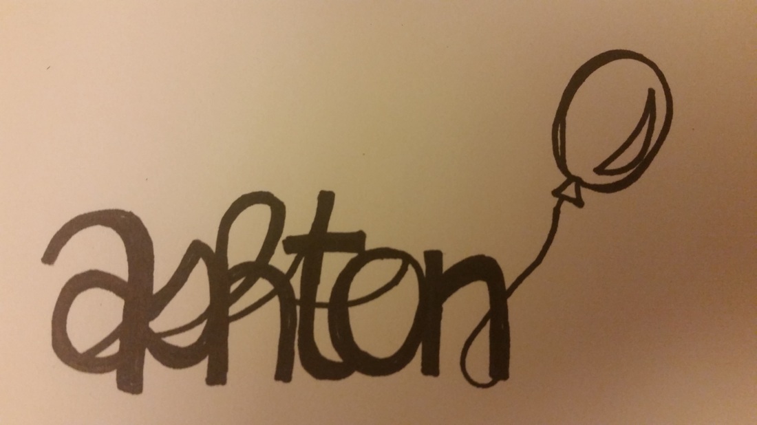
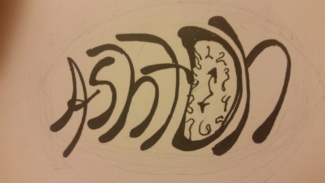
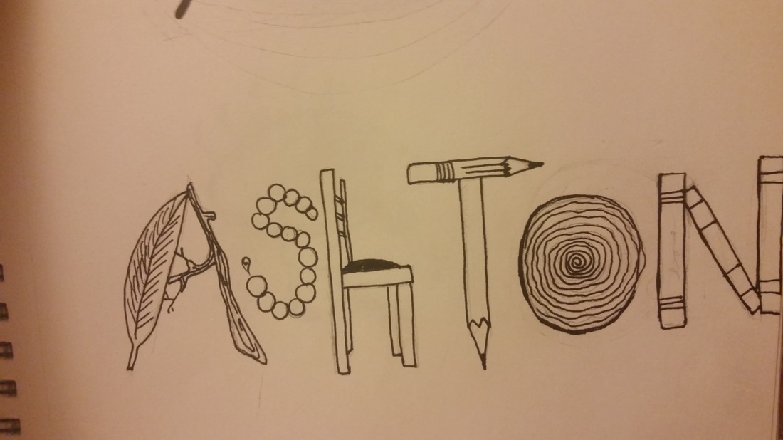
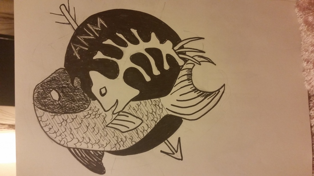
Below are some potential ideas for logo designs. This project was the most mentally taxing out of all the projects thus far. It's a big question, who are we? In what way do we want to present ourselves to others? My rat design is probably my favorite because of it's psychological references, as is the brain one. I have simpler designs which i think look nice but don't really describe who I am, only what I like. For instance, the butterfly, balloons, and spiders. All shallow representations of certain aspects of myself, but not the key component.
The City's Palette
A cool wind, and a gentle brush.
Sparkling white snow flakes drift across the windy city's horizon, glittering amongst the urban lights set beneath an ebon blue sky.
Late night walkers huddle close, reflecting brightly across crimson towers yawning into the starry heavens.
Chatter, laughter, and movement, the sounds of life echo across the neighboring frozen aquatic abyss, stretching into eternity.
Taken together, these color will surely enlighten any living space. Midnight blue, calm and peaceful, with a touch of vibrant purple to indulge the night! These colors are a must for those who desire the energy of a city, while seeking the serenity of a cool, peaceful night.
Logo In-Depth
The logo symbol I chose was a rat. There are many different ways to look at the creature
Many depict rats as untrustworthy, and foul creatures. Historically, they have been viewed as the lowest creatures, living in filth and feeding off of others around them.
Perhaps that is why the idea of a rat interests me. Rats are actually very social creatures, quite intelligent and capable of very rapid learning. They are very responsive to their environment, watching, observing, and learning. The rat, though small, embodies very significant and "big" traits: cunning, adaptability, socialization, and creativity.
In relation to my previous point, rats are used frequently within psychology due to their many similarities to humans.
Here I find my common ground.
I've never really believed in any absolute truths. However, time and time again I've found that the identity of others is our own. We are the way we are because of our experiences with other people, our family, friends, casual acquaintances, even strangers. We all need each other. We all impact one another in some way. Our existence is interconnected to not just humans, but our world around us.
My identity has always been hinged on experiences with others and the greater world around me. Identity, to me, is not a stable thing. It is continuous, always changing. Humans, like rats, are adaptable.
Rats live off humans, feeding off of the garbage as scavengers, playing their part in the grander interconnected cycle. We feed off what others give, and what they throw away. Just as the rats feed upon what we present to the world, so do we feed off of the world presented around us.
Small but mighty.
Size does not directly correspond to ability. The rat is tiny, but powerful. They are persistent, active, and clever in ways that let them achieve goals beyond what their meager physical strengths can do alone.
Conversely, rats also represent weakness. They feel fear when threatened, and often try to avoid confrontation at any cost. Rats seldomly seek out fights. They seek avoidance.
I can identify and connect to these ideas, however negative or positive they may be.
So, as a result, the rat shall be my representative, my logo.
Colors and Information
Red - This is the color of passion, lustful or angry. It is the color of life, in our blood, and it is the color of danger, signs of warning.
White - The color of purity, symbolized in religion and weddings. It can also represent emptiness, an unpainted canvas, and also embodies neutrality, with no leanings towards any particular emotional direction.
Blue - Blue is a broad meaning color. It is commonly viewed as the "male" color, used for young boys. Water is commonly attributed to blue as well. Tied into water, it can also be linked to philosophical representations of intelligence and life.
Green - Soothing, restful energy it can be seen as a the primary color of nature and its bounty. Growth and renewal also link to this color, as seen with titles like "greenhorn" implying the start and subsequent lack of current growth.
Yellow - This is a very stereotypical "happy" color, as shown in every smiling sun in a cartoon. It's carefree and full of zest. Again with the sun, it can represent warm energy and an optimistic drive forward. Some attribute knowledge and wisdom this color as well.
Pink - The color of young girls, although this meaning has rotated across genders over the years. It's a color for gentle love, in every little pink Valentine's Day heart. It can be another color of joyful happiness, "he was tickled pink", representing a positive outlook on events.
Black - The color of death and the unknown. In both of these things can be found power and mystery, leading to both deeply negative and oddly positive opinions regarding it. Negativity is more common, in forms like outsider "black sheep" individuals and the bad luck bringing black cats in folklore.
Grey - Another neutral color, it can be enduring persistence, like the steel that borrows its color. It is a practical color, and has a sense of timelessness that can last the years. Its monotone however can lead to a degree of emotional drain, with how pragmatically neutral it can be.
Purple - The color of royalty, purple bears wealth and prestige under its banner. In ages past, the cost of its dye allowed it to be a very straightforward indicator of its wearer's wealth and upper place in society. It also lends a sense of sophistication and success, tied to the former foundations.
Orange - Another joyful color, sharing its place on the Sun with yellow. It's a very positive color, full of vigor and easy happiness. It is a fairly recent color, being predated by the fruit of the same name, and was always identified as another color until it was finally identified to the world.
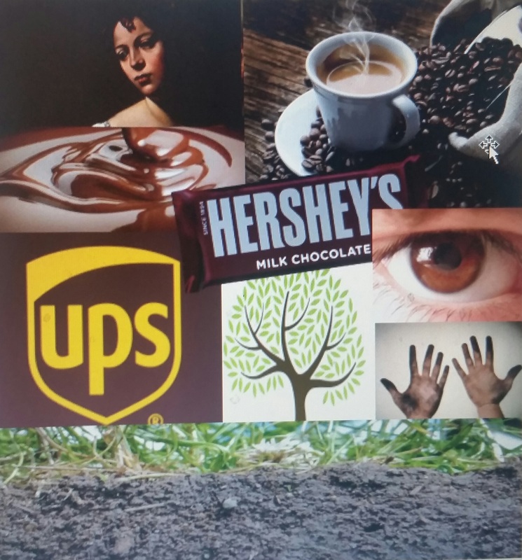
Facts of Brown
Psychology:
-Associated with reliability and stability
-Associated with the earth, therefore organic and natural
-Simplistic and durable
-Negative connotation with "dirty"
-It is a good industrial company color, or business with agriculture
-Plain, basic, modest, simple
Business
-UPS is the most widely recognized company-user of the color brown
--"What can brown do for you?"
--They use it as their color to help represent their reliability and stability
-Cleveland Browns
Marketing
-It is a more neutral color, primarily used as a background color drawing out contrast with other colors
-Especially true regarding webpages and interior design
-It is a foundation color used to expand on others
Emotion
-A fairly emotionless color
-Placid, humorless, or boring
-Suppresses the emotions
-Safe haven from stress and the outer world
History
-Color of poverty, worn by the lower class and peasants
-In ancient times, used as a common painting dye in the form of easily accessible "umber"
--Used in cave paintings, the skin coloration of ancient Egyptians, and brown Greek vases
-In the Middle Ages, brown was worn on robes as a sign of humility and willing poverty
-Most significant use of brown was at the hands of Caravaggio & Rembrandt van Ryn
--The technique/effect "chiaroscuro" used to help simulate subjects coming out of the darkness
-These days, it is a symbol of simple, inexpensive, natural, and healthy (brown paper bags, whole wheat bread, brown sugar)
Culture
-United States has associated the color brown with Thanksgiving
-India has established its use around mourning
-Japan lacks a name for the color, instead referring to it in reference to tea or fallen leaves
-Western cultures tend to more commonly associated it with earthy, healthy, dependable and wholesome
-Eastern cultures more commonly attribute it to mourning
Brown Trivia
-Brown ranks among the least favored colors
-Associated with cheap, inexpensive, and dirty
-Created by mixing complimentary colors
Photoshop and illustrator were definitely challenging, but once I learned basics, it was almost enjoyable. Of course, even hours of 'How to' videos and the teachers guidance can take you so far. I learned the basics, barely skimming the surface. Luckily for me, that's all we needed.